 |
| The World Theater in Omaha temporarily closed just like the rest of the world. |
In a prior blog post on March 8th 2020, the John Hopkins COVID-19 dashboard was introduced and it was used to highlight how the global confirmed virus cases at that time appeared to be an inflection point but was more likely a deceptively false plateau instead. This was based on a retrospective examination of what happened in China around February 13th when the resulting public outcry from a whistle-blower exposing the dire situation, led to a sudden increase of 15,000 new cases in just one day. The importance of a rigorous testing regime was then highlighted to be instrumental in any credible response to effectively curtail the virus since unknown cases cannot be treated.
In this article, a United States COVID-19 Dashboard will be provided to help you easily map where your state is with respect to flattening the COVID-19 curve, giving you a better idea of when you can expect state imposed quarantines to be lifted.
State Rankings for Handling of the COVID-19 Pandemic
The interactive chart below ranks each state by the total number tested as a percentage of the overall population. The higher the test ratio against over population, the more accurate the COVID-19 infection rate is and more trust can be placed in a governor's decision to reopen an economy or to keep it shut.
As of today, the most states have yet to test a sufficiently sizable sample of their populations so that governors can make informed decisions whether or when they can reopen their local economies.
Which states are doing the best jobs testing their populations?
Armed with the information on testing rates above, we can make qualified judgments on the reliability of data provided by each state, allowing us to adjust our informed decisions based on the confidence we place on these results.
Where are the highest number of confirmed COVID-19 cases?
Where is COVID-19 the deadliest?
Where are new COVID-19 cases rising most quickly?
The following questions may give you a better idea of not just how prevalent the COVID-19 is, but also how serious the situation is in each state.
Which states have the most hospitalized cases?
How many among those currently hospitalized are in ICU?
The prognoses for patients on ventilators generally have higher projected mortality rates the longer they remain on it. As tragic as it may seem, knowing how many are currently on ventilators could potentially be viewed as a leading indicator of where death rates are likely to be heading.
What is the ratio of ventilator patients to those currently hospitalized?
Governors face pressure to save their State Economies
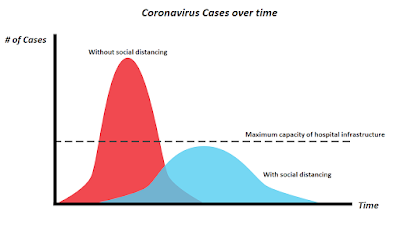
Even though we are past the most intense period when medical professionals were heroically engaging in a daily struggle to save the many people at greatest risk of succumbing to this terrible disease, the majority of the United States and a larger part of the world,is still in quarantine to flatten the curve and reduce the likelihood of over burdening hospital infrastructure.Experts unanimously agree that new daily cases must stabilize and a flattening of the curve in combination with vaccine availability have to happen together before government leaders can safely roll back the most draconian social distancing measures without a resurgence of the virus. Even so, without proper testing, it is very difficult to tell if case counts are a true reflection of what the real infection rate is.
While many realize the importance of social distancing in helping alleviate over burdened local healthcare infrastructure, it is easy to forget that this also results in extending the duration of the virus impact over time.
 |
| Flattening the COVID-19 curve |
As millions suffer from the ill effects of a self-induced stalled economy, governors are facing mounting pressure to rescue their battered economies. Some have already reopened their states despite the lack of accurate testing, putting the health of their electorate at risk. So how do you figure out if your state leaders are putting the best interested of their electorate before anything else?
Hopefully, these tools can help you obtain a clearer picture of where your state stands with respect to its neighbors and the rest of the country. Wishing you all the best as we move forward to the next phase and navigate this difficult time together.
While population testing rates are still grossly inadequate, the amount of data available for analysis is nonetheless overwhelming. To complicate things further, many adjacent states are forming coalitions that will coordinate the easing of social distancing measures to reduce the risk of virus resurgence. As such, it is important to inspect data trends not just your home but in neighboring states to figure out when your own state's restrictions are lifted. Thanks to the collective efforts of the data scientists and engineers at The COVID Tracking Project, (a volunteer effort initiated at The Atlantic), there's a tool for that,
A State based COVID-19 Tracking Tool
The following United States COV-19 Data By State Dashboard can provide you with more detail on how far your state is progressing with respect to flattening the COVID-19 curve relative to the rest of the United States.
United States - Geographical Spread of COVID-19
Click here so that it scales better in a new window.
Hopefully, these tools can help you obtain a clearer picture of where your state stands with respect to its neighbors and the rest of the country. Wishing you all the best as we move forward to the next phase and navigate this difficult time together.
The opinions expressed are solely the views of the author and not necessarily those of his employers, past or present. They should not be construed nor used solely as a basis of any decisions made without forming conclusions from other independently sourced information, related to the handling of the COVID-19 pandemic or otherwise.


