
 |
| Nice smile... I wonder what the Gini coefficient of Singapore is? |
It was a slow weekend and what better way is there to waste the hours away than at a movie theater, vicariously living the lives of the top one-percenters? Crazy Rich Asians was an awesome movie and it was easy for the audience to feel connected as some of those characters even seemed mildly down to earth, maybe sometimes even remotely admirable.
Upon leaving the dark comfort of the cinema being rudely greeted by the harsh glare of the afternoon sun, I faced the stark reality of resuming my rightful place with the 99 percent as was expected of my birthright. My mind idly wondered what the Gini index of Singapore (the movie location) was, relative to the rest of the world. A quick web search led to a publication by the Central Intelligence Agency.
From The World Factbook, Country Comparison: Distribution of Family Income - Gini Index:
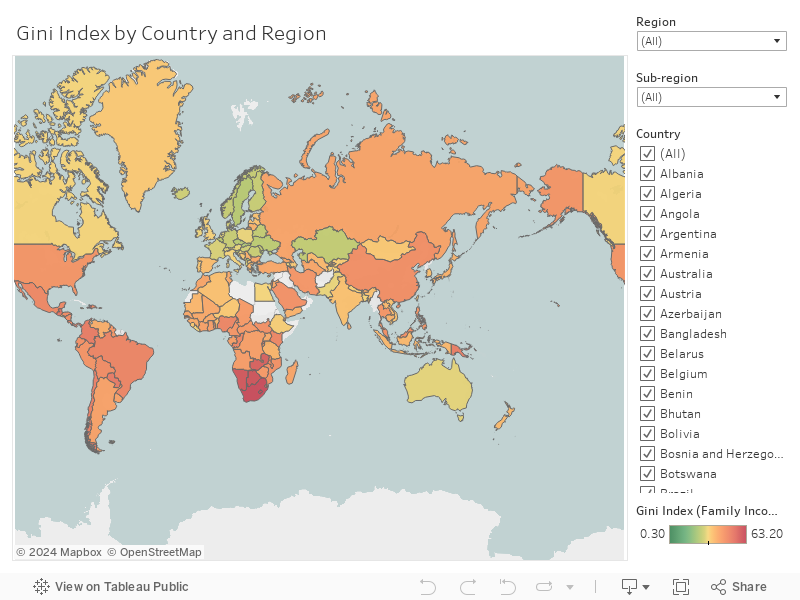
"Distribution of family income - Gini index measures the degree of inequality in the distribution of family income in a country. The more nearly equal a country's income distribution, the lower its Gini index, e.g., a Scandinavian country with an index of 25. The more unequal a country's income distribution, the higher its Gini index, e.g., a Sub-Saharan country with an index of 50. If income were distributed with perfect equality the index would be zero; if income were distributed with perfect inequality, the index would be 100."Although the data set is tiny, it's always easier to interpret it visually and a simple data visualization is attached below. One modification I applied to the data was ranking each country's Gini index in ascending order as opposed to descending order on the original data set. My subjective opinion even if unorthodox, being that the most equitable economies should be associated with a better ranking. Incidentally, Singapore was mediocre at best, ranking 122nd out of 156 with an index of 45.9 (based on 2017 data). However, do bear in mind that the data is extremely patchy and calculation of the Gini coefficient was based on income from different years for different countries.
The Scandinavians and European Union were unsurprisingly ranked the most favorably as equitable economies, while the most inequality was unfortunately skewed heavily towards banana republics and Southern African nations. The United States did not fare very well too, at 118th place (index of 45.0 based on 2007 data).
Have fun exploring the data and do share your thoughts below!


This comment has been removed by the author.
ReplyDelete